Molly Burke is well aware that there aren’t many people who can call themselves blind beauty influencers. But just because blind beauty influencers like her are few and far between on platforms like YouTube doesn’t mean there aren’t a huge number of blind beauty shoppers. And while Burke cannot speak for every blind person who shops for beauty products, she can speak to some of the general concerns, frustrations, and triumphs that come with finding products designed in such a way that elevates accessibility — and that’s exactly what she shared in a new Allure video about universal design.
For many of us, what we think about the way a logo or product name is written on packaging boils down to little more than if we like the font. For blind or low-vision shoppers, however, in the absence of Braille, the way words appear on packaging makes a huge difference.
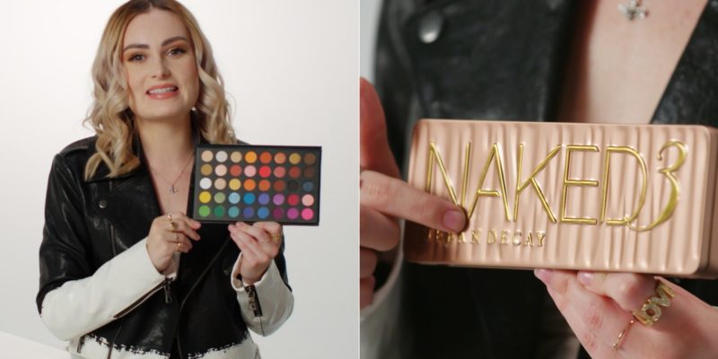
“Touch is so important, and it would be really great if more products had tactile differentiators because that would just make my life using beauty products so much easier,” Burke says, explaining that words printed flatly on a palette — as opposed to embossed, as Urban Decay does — leave her unable to determine the brand, the product, or the colors. “The reality is any tactile marker that differentiates the product or the package is going to make a big difference. For me, being able to figure out what product is what.”
Even with very small products, like lipstick, brands can find ways to indicate features of the product inside, like the finish of the case itself. “I can tell just by touching this — this is a matte-finish packaging, so I assume that lipstick is also matte-finish. And this is a glossy finish on the packaging, so I assume, I think this has more of a glossy finish to the lipstick,” Burke explains while holding up two different Maybelline lipsticks. “And so that’s really helpful. Even though I can differentiate what colors they are, I can at least differentiate what finished the lipsticks are.”
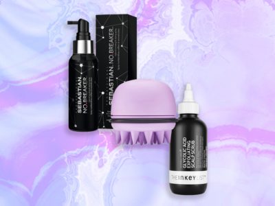
It’s not just makeup products that can implement signifiers for those who are visually impaired. Something you might have not even noticed on your Herbal Essences bottles: “Right on the bottom at the back, there’s a bunch of small circles or dots,” Burke explains. “I can feel right down here at the back, there’s stripes for shampoo. So S, stripes, shampoo; C, circles conditioner.” She says this is important because not all blind people can read Braille, so it’s clear that the brand made an effort to create a tactile label that everyone can read.
Burke goes on to discuss the kind of mascara packaging she finds most reliable, the palette formats that are the bane of her existence (her words), and the kinds of products she avoids altogether in her beauty routine. You can watch the entire video below.
More on accessibility:
Now check out Molly Burke’s bathroom tour:
Follow Allure on Instagram and Twitter, or subscribe to our newsletter for daily beauty stories delivered right to your inbox.