April showers bring May flowers. And then summer arrives, its radiant light is diffused through the humid air, and that’s why June is full of rainbows.
When a sunbeam crosses paths with a raindrop, it explodes into a brilliant series of varying wavelengths that the eye distinguishes as different colors, from red (the longest wavelength, crest to trough) to yellow to blue to violet (the shortest). The phenomenon happens often enough to warrant almost no media coverage, except for once in 2010, when a video of two parallel rainbows arching over Yosemite National Park went viral. Not because double rainbows are rare — they aren’t — but because the man recording the video was so moved by the experience that he could not help but speak to the sky.
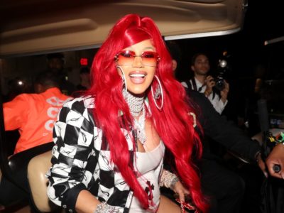
The rainbow itself came out in the late ’70s. Harvey Milk, then California’s first openly gay politician, asked the artist and drag queen Gilbert Baker to design a symbol for the nascent LGBTQ+ rights movement. Gilbert went with an eight-stripe rainbow flag, with each color representing some salient element of the gay experience, beginning with hot pink (the carnal), moving through yellow and green (sunlight and nature), and ending at violet (the spirit). Eventually, the hot pink was dropped, and turquoise and indigo coalesced into a single blue. It’s flown everywhere love is, but especially in June; the month of pride.
Summer in the northern hemisphere arrives with rainbows, but we see them all of our lives. “Is there a person alive who can’t say that when they were a child, they drew pictures of rainbows?” asks Leatrice Eiseman, who is officially the executive director of the Pantone Color Institute and unofficially the most prominent color expert in the Western hemisphere. From the cinnamon sands of Tucson, she advises the rest of the human world on the art, science, and business of color. Pantone’s library of shades includes over 3,000 unique colors spanning the visual spectrum — only about three ten-thousandths of a percent of the colors the human eye can perceive (up to 10 million). But they reverberate throughout our lives anyway.
What is McDonalds without blazing 485 C (the juicy red of Happy Meal boxes) and golden 123 C (“French fry yellow”)? In The Devil Wears Prada, Meryl Streep tries to impart the meticulousness of color in fashion by eviscerating Anne Hathaway after she conflates two shades of turquoise. Hathaway’s sweater, Streep points out, is cerulean, a variant of cobalt that she says was adopted by the fashion industry in 2002 — two years after the real-life Eiseman and Pantone announced cerulean as the color of the millennium and the company’s first Color of the Year. Hathaway’s character, tragically, wears it in 2006.